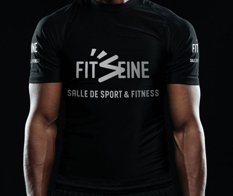
 Logo / Fit’Seine, salle de sport & fitness à Rouen Fit’Seine est un club de sport spécialisé dans la remise en forme et le bien-être. Classé parmi les meilleurs de Rouen, il se démarque par sa convivialité et une équipe bienveillante, constituée de...
 Logo, identité visuelle, cahier de recettes / Olivier MAGNE · MOF Olivier MAGNE est un boulanger Meilleur Ouvrier de France, aujourd’hui consultant et démonstrateur, en France comme à l’International. Expert en boulangerie viennoiserie, il a précédemment enseigné à...
 Logo / La Nouvelle Boulangerie, par Julien MALCURAT · maître artisan La Nouvelle Boulangerie est une boulangerie pâtisserie située à Royan, en Charente-Maritime (17), ouverte en 2023. Julien MALCURAT, maître artisan et ancien formateur boulanger, y propose une gamme...
 Ensemble : boulangeries et école de boulangerie coréennes Ensemble est un projet né autour de la passion, du partage et de la transmission du savoir boulanger.Sous cette dénomination sont réunies une entreprise et une école de boulangerie – le « baking studio »...
 Olivier GUILLAUMET ostéopathe D.O. Olivier GUILLAUMET est un ostéopathe D.O. (Diplômé d’Ostéopathie), professionnel de la santé depuis 1995 et installé à Rouen. Il est également masseur-kinésithérapeute D.E. (Diplômé d’État) et diplômé en Santé Diététique...